How to Conduct UX Audit, Best Practices
We all aspire to do something or the other in our lives. If we achieve what we had planned we take the credit and pat our backs. But what if we fail to achieve it? Isn’t it our job to stop and retrospect what went wrong? The best approach is to evaluate the whole process and work on our shortcomings. A website works similarly.
Imagine you are getting a lot of traffic on your web and mobile apps but the traffic is not staying on your page for more than a few seconds. Now, even if the virtual footfall is high, it is not benefitting you at all. Reason being:
- Every one in two visitors leaves the web page in less than 6 seconds due to poor loading time.
- 21% of users leave the website because of the slow loading time of the payment window.
- 40% of the customers leave a website because of complex navigation.
What comes to your rescue in such a scenario is UX design audit. Any UX design is incomplete without UX audit. It helps a designer to understand what a user is experiencing and how helpful the design is for them. As Brenda Laurel rightly said, "Design isn’t finished until somebody is using it".
Introduction
UX design audit is nothing but the process that involves identifying the issues about the use of an application, website, etc. by performing heuristic user research. If conducted effectively, a UX design audit helps in creating an easier and more seamless experience for the users. Which in turn increases:
- Customer satisfaction
- User Engagement
- Conversions

Now before starting any UX audit, it is of utmost importance to understand the following things:
- Why do we need UX design audit?
- When to conduct a UX audit?
- How is it going to benefit us?
UX design audit is essential as it helps us in understanding user behaviour. It helps in finding out how seamless is the interaction between an interface and a user.
UX audit can be conducted at any point in time. You can carry out a UX design audit even before the final web product is launched or after it has been used by end users for a certain period.
UX audit has several benefits but primarily it helps in:
- Understanding the difficulties encountered by users during navigation or with other functionalities of the interface.
- Analyzing users’ behaviour and their needs.
- Finding out the ways to fill this gap and make your app or website more efficient in terms of business.
Points to remember before conducting UX Design Audit
UX audit is a very analytical process and it is good to ensure that you are well prepared for it. Here are few things you should get sorted before the commencement of the audit.
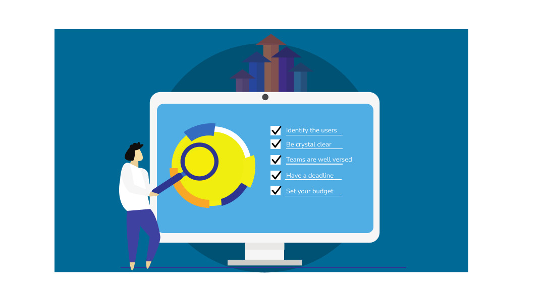
- List of challenges: List out all the possible challenges that you believe your customers might be facing. It could include anything from inconsistency, wait time, payment gateway issues etc.
- Clarity of goal: Conducting UX design audit without determining the goals of an organization is of no use. Hence it is vital to define organizational goals such as the increased number of customers by the end of the given year. Or what could be the percentage of the conversion rate for the given quarter.
- Have a deadline: There should be a well-defined time limit given to the experts involved in UX audit as it can go on and on.
- Set your budget: Ensure that you have a proper budget to carry out the audit. For this it is of utmost importance to have idea of the latest quotes and how much money can you spend on it.
Step-by-Step Process of UX Audit
It is essential to understand the process of UX audit step-by-step. Let's have a look.
Interact With Users and Stakeholders
As they say, there is nothing better than a man-to-man interaction. It is very true while conducting UX audit. Interacting with individual users, stakeholders, and developers, help you understand their respective point of view on a product, service, or application. You can also carry out various surveys that will help you understand the ground reality of any product.
This data when gathered mindfully can be validated by conducting usability tests. For example, if a user has claimed to have faced issues in the checking out process of an e-commerce app, you can verify and further work on rectifying the issue.
How Can This Data Help You?
This data will help you in identifying user personas and understand the customer journey more effectively. You can also perform competitor analysis and determine the direct and indirect traffic on their websites. This also helps in analyzing search engine rankings, product usability, and so much more.
Once you have interviewed the stakeholders and users, you can now use any of the most commonly used approaches for UX design audit. Depending upon the industry type, project, and product your approach may vary. These approaches give metrics that are further helpful in analyzing the data.
Heuristic Evaluation
Heuristic Evaluation is the process of analyzing the usability of any website, or mobile app with the help of established heuristics, most commonly Neilsen-Molich's. It helps in getting insight into a product and helps the designers in enhancing a product’s usability. Listed below are some of Neilsen-Molich's heuristics that help an expert analysis of your product:
- Users should be aptly informed about the state of your product.
- Use real-world language to communicate any information to the user.
- Offer controls to users and allow them to fix any error in a hassle-free manner.
- Maintain consistency throughout the product such as the use of icons etc.
- Ensure adding warning messages where there is a risk or chance of an error.
- Any relevant information should be visible to the user.
- Do not clutter the interface with any unnecessary information.
- Errors should be displayed in an easy-to-understand and simple language.
How Does This Help?
Heuristic evaluation streamlines the whole process by making things crystal clear as an evaluator, you will be:
- Able to focus on relevant issues.
- Figure out the issues with every element individually and access their impact on user experience.
- Get productive feedback.
- Able to sync it with usability testing.
- Able to find out optimal solutions.
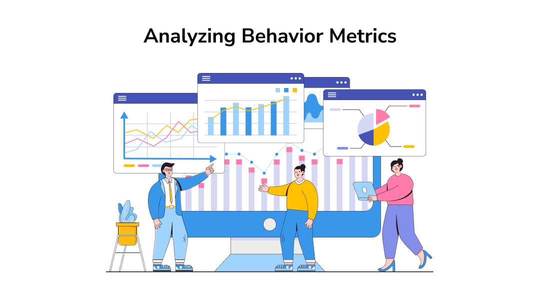
Analyze Behavioral Metrics
These metrics are dependent upon the behaviour of a user such as:
- How long do they stay on a website?
- What is the user flow on any website?
- What was the user browsing before landing on your website?

All you have to take care of is to go far back where you have enough data to carry out the analysis. This can be done using several tools available online. At your convenience, you can choose free or paid tools.
Conversion Rate
If the premise of your UX design audit is say an e-commerce site, then the data that would interest you would be different. For example, you publish the summary of blogs every day on your page. Now the data that could be helpful to you would be the number of downloads, the number of users who read the summary, minutes spent on the blog, etc. This way you will be able to get an insight into what fits the needs of your customers and what interests them the most. Eventually, this helps in performing UX audits from a different perspective.
Once you have used any of the aforesaid approaches your next step is to organize the data and find out ways to evaluate it.
Data Organizing
Once all the essential data required for UX design audit is gathered, there comes the question of organizing it. Spreadsheets are one of the best ways of data organizing. You can use online spreadsheets that are shared with all the concerned teams. This way everyone will stay on the same page thus helping you gather input from everyone in the team. These inputs can further help work on the improvements for areas discovered during data gathering. For example, this data helps understand the best usability practices.
Analyze the Data
This step involves figuring out the weak points and any shortcomings of a product. UX auditing at this step involves listing down all the pinpoints that might have caused frustration, unpleasant experience, and disappointment in a user.
It has been observed that several organizations have benefited a lot from screen-by-screen auditing, where they analyze the impediments throughout the user flow. This gives a clear picture of the areas that need improvement.
For example, an app is so responsive that every function is carried out seamlessly by the user yet they face an issue at the time of checkout. Another issue could be the items wished listed are not there in the wish list anymore. These seem to be small issues but have a huge impact in terms of deteriorating user experience. Such issues are taken into consideration at the time of analyzing the data.
Scope of Improvement
After a thorough analysis of the above data, the findings lead to improvising the areas that have issues. This could be anything from visual design, responsive design, message clarity, and so on. A few important things to take care of are:
- Coming up with a design that brings more conversions.
- Ensuring the logo of the brand is clear and visible.
- The colours, text, and font used are accurate.
- The UI is more responsive.
- Page loading time is reduced.
- Images are not compressed and take time in loading.
- The quality of content should be good and easy to understand.
- Unnecessary buttons, an ambiguous text, and headings should be eliminated.

Conclusion
If these basic UX design audit practices are followed in a streamlined manner they can not only help in conducting excellent audits but the end result would be increased conversion rates, better user engagement and more importantly, increased brand value.


