Heuristic Evaluation: A Complete Guide
Have you ever felt that despite putting all your efforts into creating a successful product, the customers still don’t want to use it as it is not providing the best user experience?
Well, let me explain why. When you’re designing a product from scratch, it can be easy to assume that the users will intuitively understand how you intended it to be used. However, this isn’t typically the case. The same features that you find to be incredibly simple to use may leave your users perplexed and discouraged—unless you design your product to meet basic usability criteria. If your users are complaining that your product is confusing, inflexible, or error-prone, it’s important to take a step back and reevaluate your design. And the best way to accomplish this is by using a heuristic analysis. Now, let's understand what is heuristic evaluation?
What is meant by Heuristic Evaluation?

Heuristic evaluation is crucial for developing a great product that users can easily engage with and find valuable. It is a comprehensive evaluation of the user interface of a product. Its objective is to uncover usability problems that might arise when users interact with a product and suggest solutions.
The main goal is to increase the product’s usability, and another factor is efficiency (in this context, "efficiency" is the speed with which a product can be used as a direct consequence of better usability). The UX of a product is significantly enhanced when these components are provided at a high level of quality.
Although there are many heuristics principles created by different experts. In this article, I attempt to explain the 10 rules with examples by Jacob Nielsen who created the Heuristics for User Interface Design in 1995, which are the most commonly used standards in usability inspection.
What is Nielsen's Ten Heuristics?
Lets understand the famous 10 heuristic principles by Jakob Nielsen.
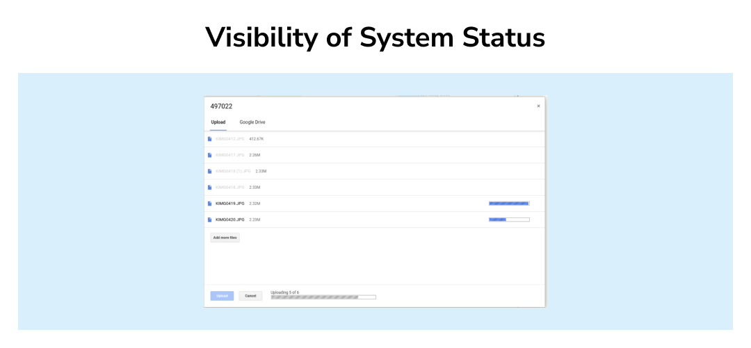
- Visibility of System Status: Users should constantly be kept updated on what is happening by the system through relevant feedback delivered on time. One example of this is Google Drive showing the status of a document upload.
- Match Between the System and the Real World: The system should communicate what the user understands, using words, expressions, and concepts that are familiar to the user instead of just system-oriented terms. Try to work with real-world norms by arranging information in a logical and natural order. An example of this could be the folder icon from Microsoft which resembles the real-world folder.

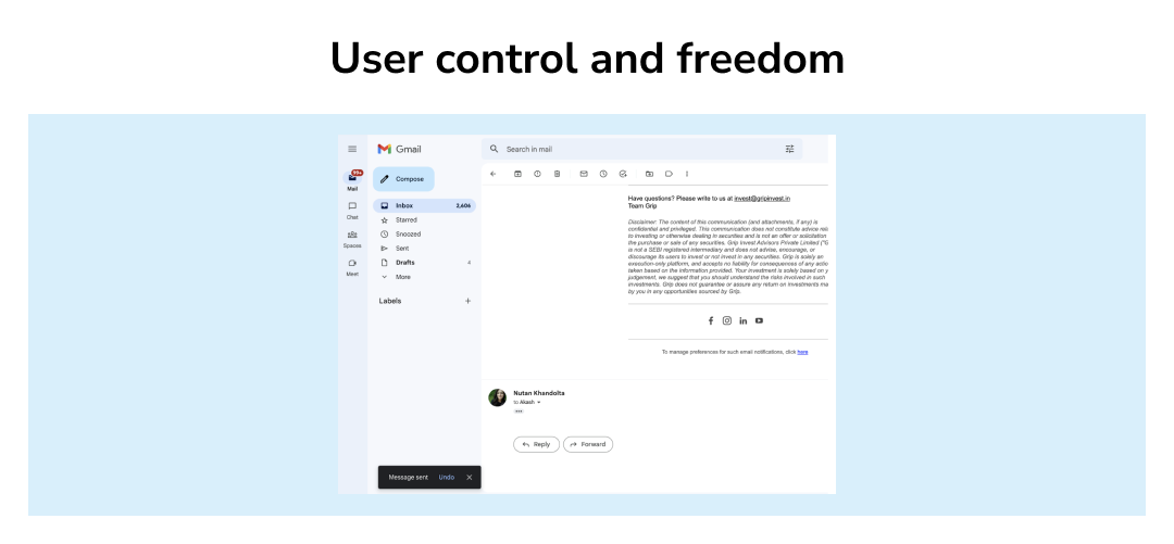
- User Control and Freedom: Users frequently choose system operations by mistake, and they will require an obvious "emergency escape" to get out of the undesirable state without having to engage in a lengthy conversation. Preferable solutions should be undone and redo.
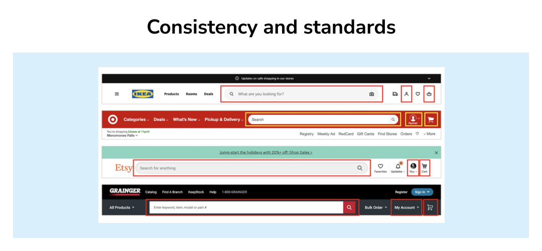
- Consistency and Standards: Users shouldn't have to guess whether certain terms, scenarios, or actions are identical to each other. Example: All these ecommerce websites shared below follow the same navigation standards. A prominent search bar, simple account access, and an unmistakable shopping cart are all displayed in a similar manner.
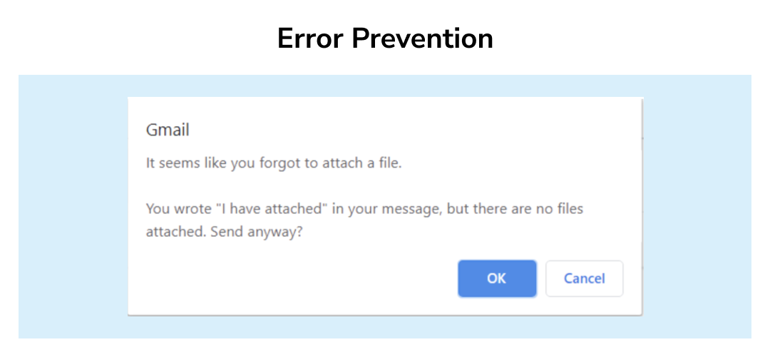
- Error Prevention: A thoughtful design that prevents a problem before it occurs is preferable to good error messages. Eliminate error-prone situations, or check for them and provide consumers with the chance to confirm before committing to an action.
- Recognition rather than Recall: Make objects, actions, and options visible to the user to reduce the cognitive burden for the user. The user should never have to recall information from one part to another. Help text & system instructions should always be easily recognizable and can be retrieved at any given time. Here's an example of Quora suggesting questions based on what I'm typing.

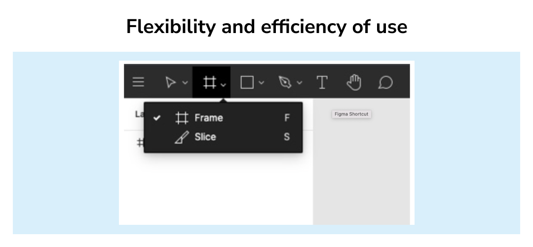
- Flexibility and Efficiency of Use: Unseen by the novice user, accelerators may frequently speed up the interaction for the expert user, allowing the system to cater to both inexperienced and experienced users. Allow users to customize frequently performed actions.
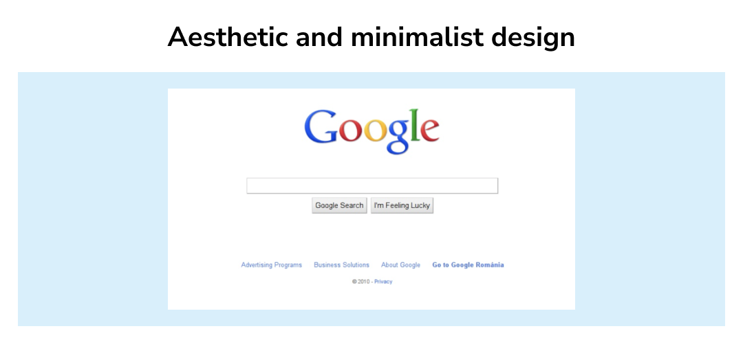
- Aesthetic and Minimalist Design: Information that is unnecessary or rarely used shouldn't be included in dialogues. Each additional piece of information in a dialogue clashes with the relevant pieces of information and reduces their relative visibility. Google's homepage is a great example of minimal design.
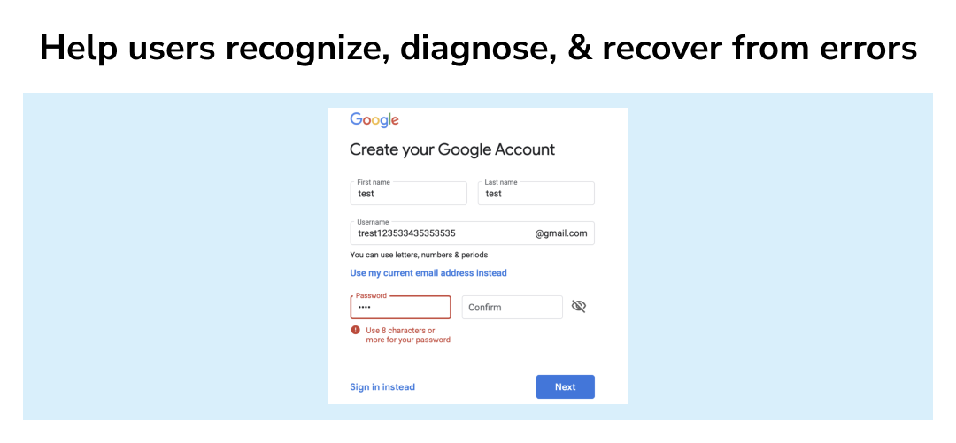
- Help Users Recognize, Diagnose, and Recover from Errors: Error messages must be written in clear words (no codes), accurately describe the issue, and helpfully offer a solution.
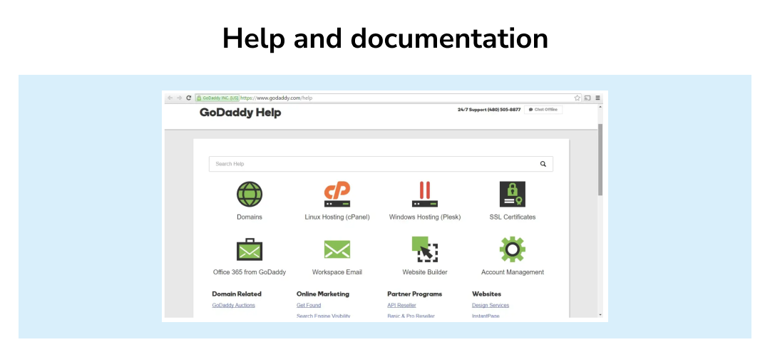
- Help and Documentation: Although it is preferable if users can operate the system without assistance, additional help and documentation may still be necessary. Any such documentation should be concise, focused on the user's task, easy to search, and describe specific actions that need to be taken. An example of GoDaddy's Help page is shown below. While there is a search field, the page also includes main categories and frequently asked questions.
How to conduct a Heuristic Evaluation?
- Decide what you are Evaluating: Before initiating the Heuristic Evaluation be certain about what you are evaluating, is it a feature on your website or app? Or is it a whole page or a user task across different pages? Figure out first. After you decide on the tasks, any type of wireframes/mockups/prototypes can be your materials for evaluation.
- Select Evaluators: Heuristic evaluations utilize usability experts to go through the site with an educated eye to test out the product, so make sure to carefully choose your evaluators. The evaluators should be usability experts and preferably with domain expertise in the type of industry that your product is in.
- Follow Severity Ratings for Usability Problems: Severity ratings can help determine where to focus extra usability efforts and how much money should be spent on fixing the most critical issues. Nielsen's explanation guided the severity rules I used. It takes three main factors into account.
- Frequency: Is it common or uncommon?
- Impact: Will the users find it easy or difficult to resolve?
- Persistence: Is this a one-time or recurring issue?
And also the rating can differ. It is largely decided by your requirements. I followed Nielsen's instructions in this particular instance.
0 = I disagree that this is a usability issue at all.
1 = Only cosmetic issues should be addressed unless additional time is available on the project.
2 = Minor usability issue: Low-priority fix
3 = Major usability issue: High-priority fix
4 = Usability disaster: must be addressed before the release of the product.
- Analyze the Evaluation Results: In this part, you are going to prioritize the severity. Remember to discuss the suggested solutions with the evaluators. You have to ensure that you are on the same page. And then list your findings and split them into different iteration stages to find out the best possible solution.
Conclusion
Heuristic evaluation is a great way of identifying usability problems in your product while spending less time and money. Today, many product owners want someone to perform a quick audit and advise them on the simplest and quickest fixes. A heuristic evaluation provides much more. It's a method for defining and thinking about your deeper core issues so you can focus your energy on what matters the most.


