Designing the Future Electric Vehicle Cockpit
Introduction
The automotive industry is moving towards safe and smart vehicles with enhanced in-vehicle user experience. Driving is no longer a case of just turning the wheel and pushing the pedals. Now, the task requires balance. The driver must control the vehicle's motion while also ensuring an engaging in-vehicle experience.
Innovative technologies such as infotainment systems connect entertainment and information to the driver and the passengers through audio/video interfaces, controls the button panel, voice commands and more. These systems are seamlessly integrated within for the users to control multimedia, browse phone books and make calls, select destinations for navigation climate control within the wall pillars and a lot more. This outstanding electric vehicle design needs a lot of background work.
In-vehicle technologies like ADAS systems, connectivity solutions, climate control, smartphones, and sensors are pushing boundaries to provide a great driving experience.
Surely, infotainment systems have transformed cockpit designs from static LEDs of the past to smart, highly graphical interactive displays of tomorrow thus making it the cockpit of the future.
With growing automotive technologies, a user demands connectivity, safety, an intuitive Human Machine Interface, a responsive touch-screen, updates and seamless integration of apps in the IVI system. Keeping in mind these expectations and challenges, below are 6 guidelines designing for the future EV cockpit.
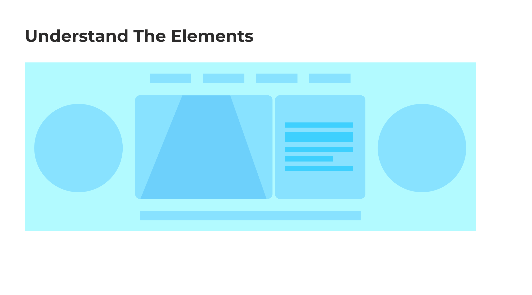
- Understand the Elements: Understanding the requirements is highly effective in designing the needs of the concept. This is a case of an electric car that is distinguished by three screens: a Digital instrument cluster, a centre OLED, and a passenger display. Designing infotainment screens for an electric car requires attention to details such as battery information as a replacement for RPM. There are rules to be maintained such as the industry standard font sizes, icons and alignment. A laid-out map of the elements gives a picture of the placement and a sense of space between the elements. A holistic scenario of what goes where and what is needed gives better insights into making better design decisions.
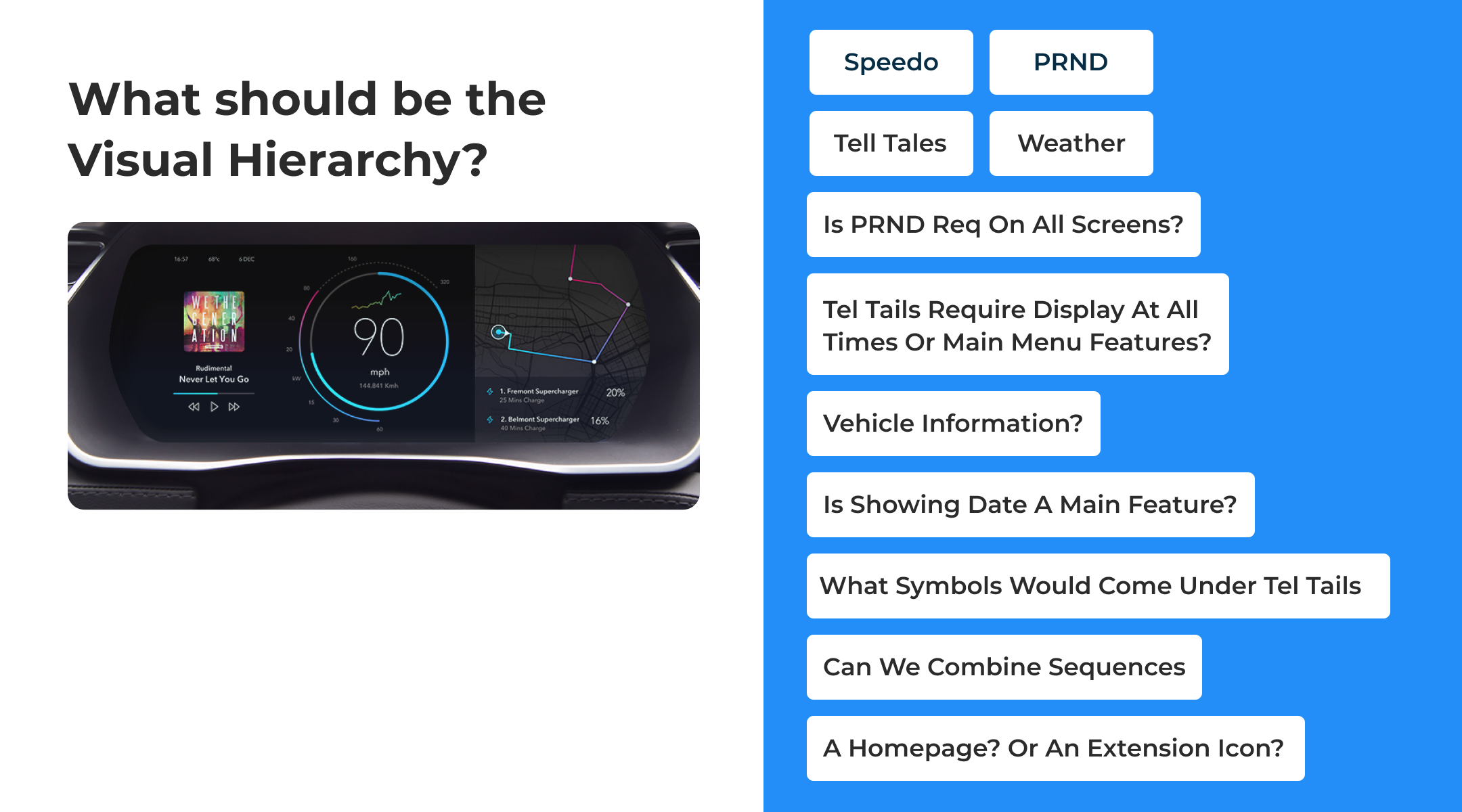
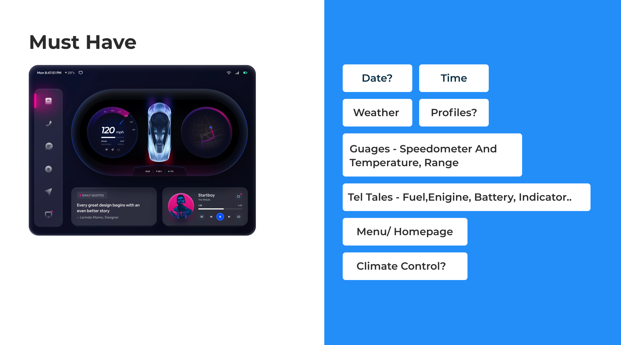
- Question the Elements: Once the idea has been laid out questioning the design decisions such as the choice of telltales, visual hierarchy, must-have, can’t have and won’t have features, and timing of the features, all lead to a better vision of the screens.
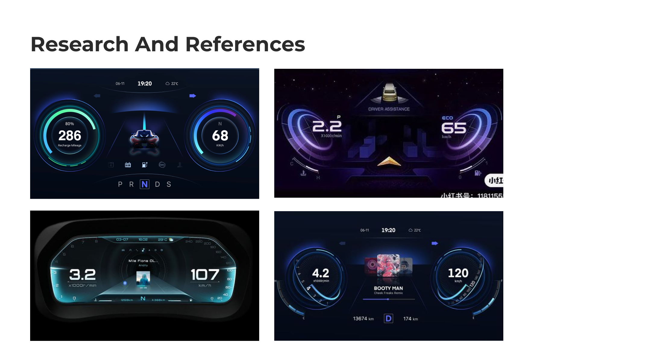
- Research and References: Once the idea is laid out and the important questions have been asked, reaching out to the latest electric vehicle designs in the industry, and looking for references that align with the design principles helps better with the imagination and broadens the scope for a better design.
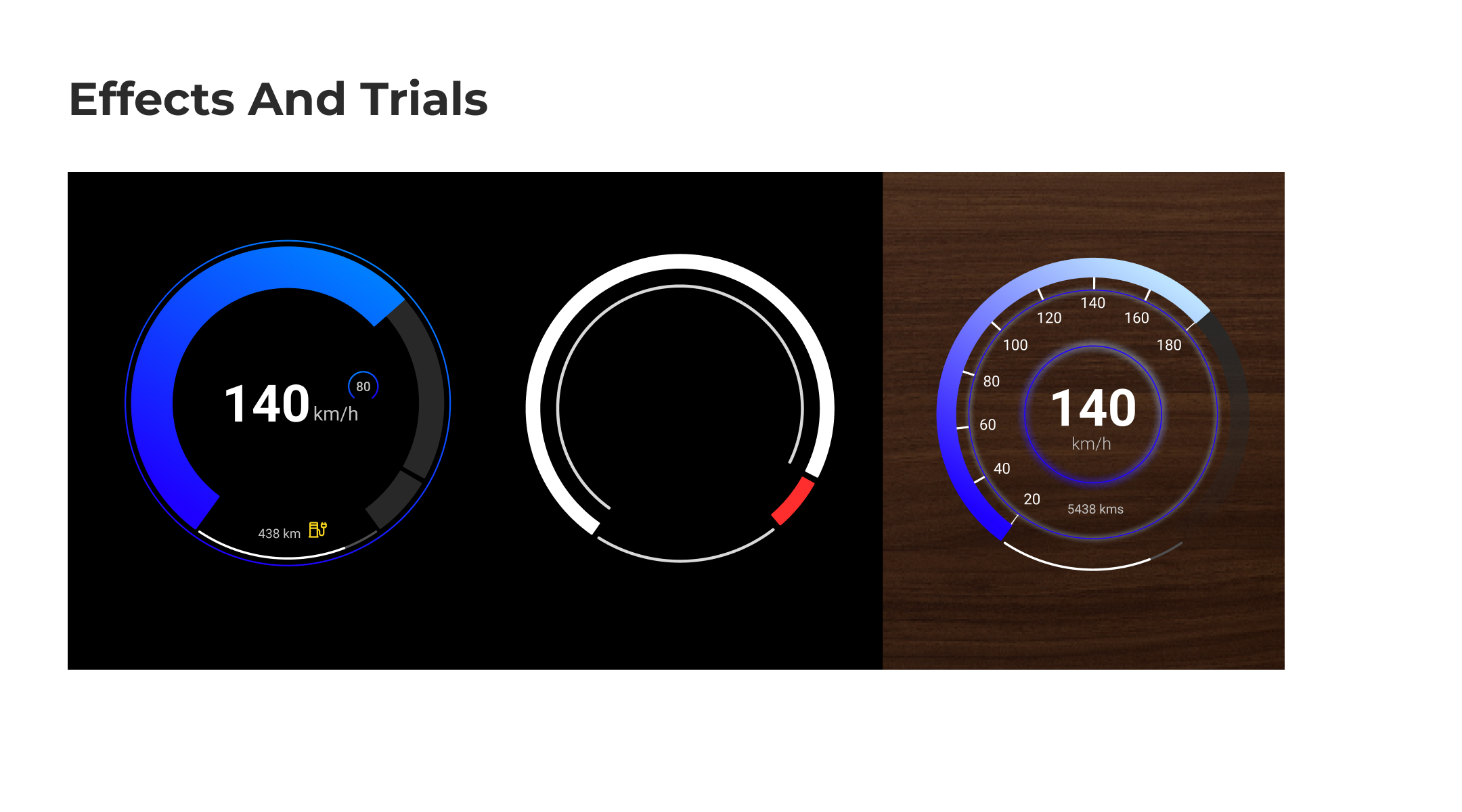
- Effects and Trials: The growth of software-defined functionality comes with endless possibilities. Dark surfaces, Hidden surfaces or tactile surfaces such as wood, aluminium and other textures are replaced on the dashboard. So, “with great power comes great responsibility”. The challenges would be to create minimal, high-contrast, visible, readable and accessible design elements. Nevertheless, experimenting with effects such as striking gradients glows, high-contrast palettes, solids and much more only directs to a better understanding of what works better.
- Think Interactions and User Experience: In this case, the electric car is distinguished by three screens: a Digital instrument cluster, a centre OLED, and a passenger display.
- Keeping in mind the driver’s duty, minimizing driver distraction to ensure maximum driver safety is a top priority. The digital cluster should display top-priority information as non-interactive visuals of the navigation, media, tire pressure etc. The key is to balance information for the driver to overview while in action. In the case of navigation, a direct approach to the directions Turn-by-Turn would be optimal.
- In the case of an electric vehicle, the car’s battery is the greater priority in association with the distance. The gauge's speedometer and battery must be clear and visible with minimal design elements. Hierarchy is one of the major principles at play.
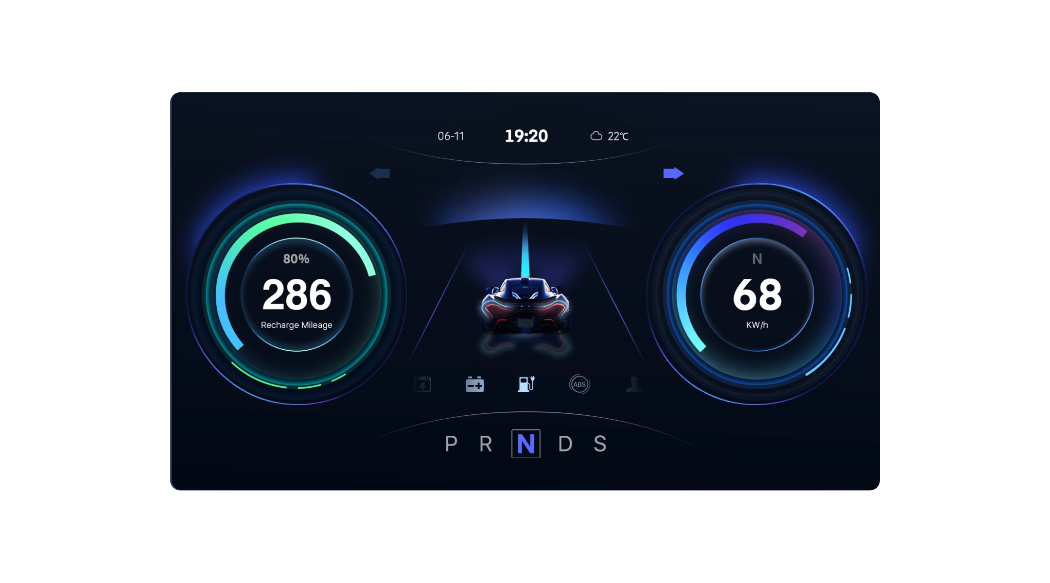
3. The centre OLED should display an overview of the top widgets mostly including route, media, warnings etc.
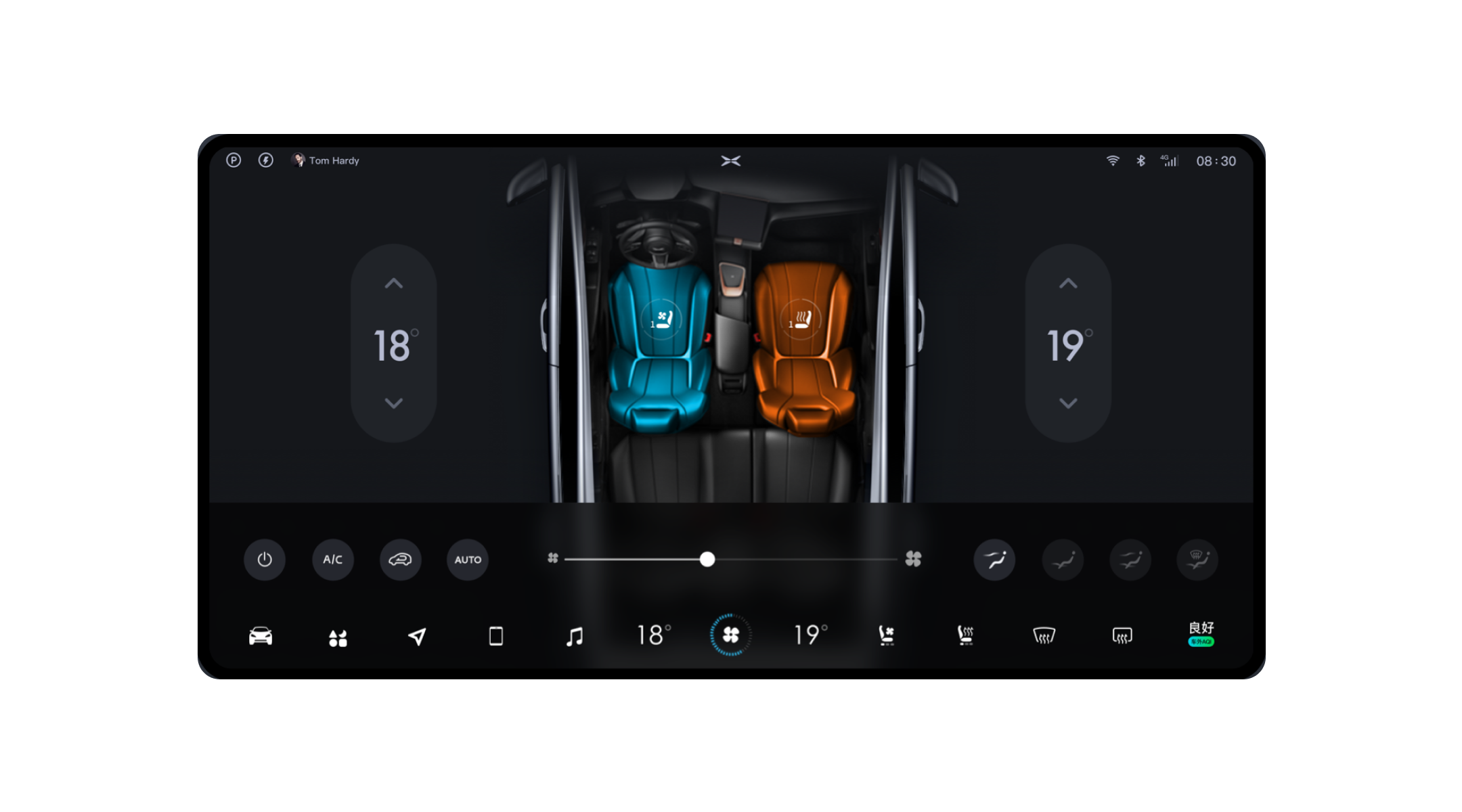
4. The passenger display should provide flexibility within the controls and provide extra room for further interactions for the non-driver user like HVAV/Climate Control, Media, Navigation with Point of Interests information, and more.
5. Make elements minimal, adaptive, and spacious around the interactive buttons.
6. Designing the screens must be easy, glanceable and actionable information to reduce cognitive stress and load on the user.
- Accept and Adapt to Changes: Despite numerous trials on layouts, designs, visuals and effects there are always stops at practicality, functionality and usability and the challenges that come with it after every screening test. Accepting and adapting to changes is the ultimate key to achieving a sensible and accessible design and building the cockpit of the future.
Conclusion
At Fibonalabs, we also follow the same mantra of adapting to changes. Whether it is UX/UI design, product development or cloud solutions, our team of experts stays up to date with the latest changes.