Boost a Fintech Startup's Success Through UX Design
Fintech is a word formed from “finance” and “technology”. It refers to the usage of technology to enhance and automate financial services. Examples of fintech services in our daily life would include credit card payments, UPI payments, online investment platforms, net banking, personal finance management, etc. A fintech application helps companies to merge their businesses and transactions with ease while scaling up and down. It removes the need for middlemen in financial processes and puts the power directly in the user’s hands.

Examples of Fintech Advancements in Real Life
Scenario 1
Due to a personal emergency, I needed a loan, so I went to the bank.
I went to the nearby branch of the bank to take the loan. I had to fill out a form and attach different documents with it. Then, I had to wait in a queue for more than an hour or two. After waiting two hours, I couldn’t apply on time because the bank was closed for a lunch break shortly before my turn.
While travelling back home, one of my friends suggested I download a banking app. So, I downloaded the bank mobile application; I applied for the loan, entered the amount, and with a few clicks the bank transferred the money to my account, the feature was named an instant loan. I completed the entire process within minutes.
Inference
Here, a fintech application comes in handy in times of emergencies like these in comparison with traditional banking methods.
Scenario 2
I was scrolling through Amazon’s catalogue to buy a headset. While I was scrolling through the payment options, I saw that there was a discount coupon for 30% if the payment was done via Amazon Pay. I chose the online payment mode instead of the Cash on Delivery option as it was more beneficial.
Inference
Here we can see that along with the increase in the popularity of online shopping applications, there is an increased demand for fintech services also.
Fintech and UX design
Since the primary goal of the fintech applications is to ease financial transactions and ensure security for the user, the design must be extremely understandable, usable and trustable. The design should follow a human-centric approach, keeping in mind the nuances of financial transactions. According to the findings of Stanford’s Persuasion Technology Lab, almost 46% of consumers consider design as a key factor when determining a company’s credibility. This implies that the design of the app is equally as important as its functionality. The design gives the consumer the first impression of the application.

Investing in a proper UX design team can be challenging at first, but in the long run, boosts the business value of your company. Here are a few insights on the business value of UX design to give your fintech startup its needed grand launch!
- Conversion of Leads to Paying Customers: I was looking for a great investment application and came across one such sponsored app via a YouTube channel. I downloaded the app and started using the trial account. The interface was very complicated to understand. Being a dark mode user, I had to change my phone settings to view certain fonts clearly as the app was not adapting to the system’s dark mode theme. The call-to-action buttons were too small that I had to use my Stylus to click on them. I found the design extremely inconvenient and that made concentrating on the investments hard. I uninstalled the app even though there was a great offer code.
While I was doing so, I came across another app in the suggested downloads and tried it out. I started using the trial account in the app, without changing my system’s default theme to light mode, which was the first thing I liked about the design. The text, CTA buttons and themes were legible and simple, which made understanding the app easier. The data was represented in a neat, graphical method, to give a clear idea about the investments. Navigation through the app was extremely smooth and to the point, which helped in quick learning about the interface. The app did not have any offer codes, but I chose to retain it as it was much more comfortable to use.
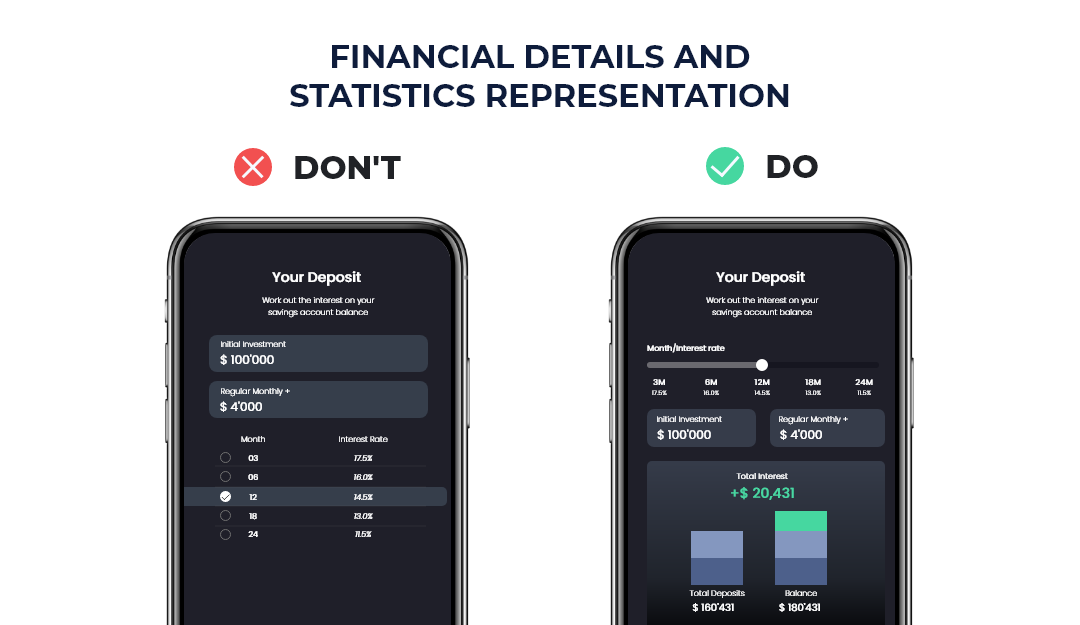
Here we can observe that, even if a product is strongly marketed, it fails to nail the user count if it has a poor UX design. The number of downloads may increase due to the well-versed marketing strategies, but only a great UX design would ensure the leads become paying customers. Hence, UX design influences the marketing and business strategies of a fintech app, which eventually affects the revenue of the company.
- Reduced Development Costs: The resources incurred for fixing an error after the product hits the market is comparatively higher than fixing one spotted during the design phase. While we tend to prioritize the efficiency and functionality of the product, even a minute detail can make or break the product. People are mostly in a hurry while performing financial transactions, so no one would like to play around with CTA buttons placed in unfavourable positions or a homepage with jarring colours and blingy text. A user tends to avoid a fintech product if it’s inconvenient to use, even if it has great backend functionality, as there are different options to choose from including traditional banking systems. for example, old people may opt-out of digital banking and stick to traditional financial services if they do not understand how to use the app. Some people also switch to the competitor fintech apps in the market, which brings down the revenue for the company.
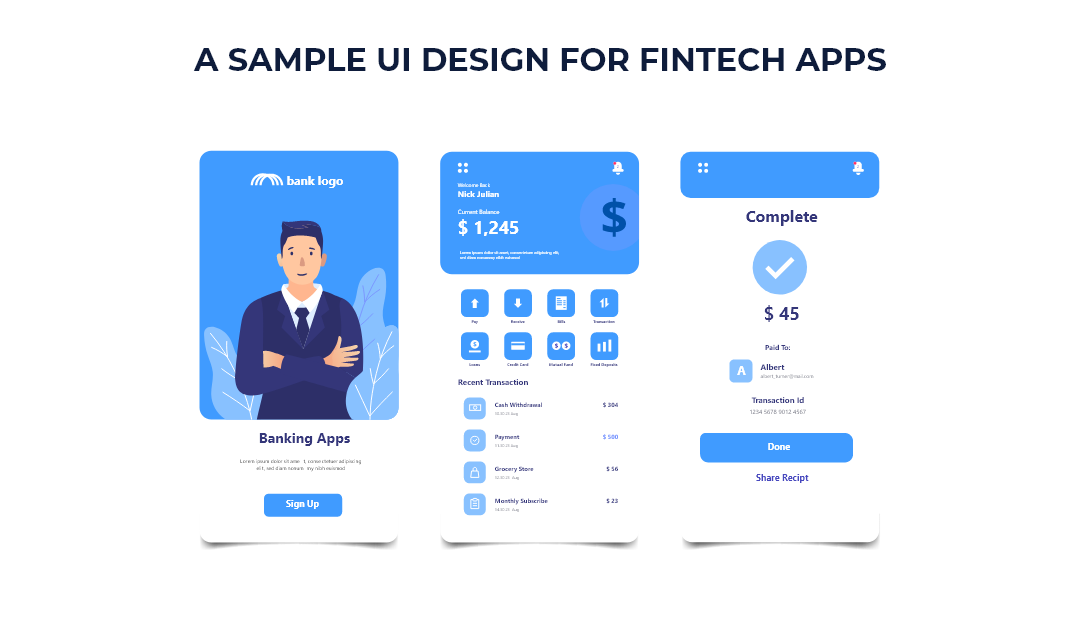
The budding fintech can assign or hire designers to get insights into how the users interact with the product. The UX designers give their inputs by talking to the targeted demographics and carrying out strategies like empathy mapping, persona formulation, first click testing, etc. to unearth hidden issues and touchpoints.
- Establishing Brand Loyalty: There are a lot of fintech applications which offer the same functionality. For example, there are many apps such as Paytm, Google Pay, PhonePe, Amazon Pay etc. which offer similar services i.e., UPI payment modes. Due to this availability, we tend to stick with the brand which offers a comfortable UX design.
The QR code scanner is located in the top right/top left corner of applications like Google Pay, PhonePe etc. As a one-hand user, I found it extremely inconvenient to achieve the touch target. I normally use the QR code scanner when I am in a hurry at the grocer or a retail store. During such instances, not being able to easily access the icons is frustrating. Google Pay has analyzed this issue and offers the swipe right motion to use the QR code scanner. Due to this improvement, now Google pay is my go-to option when using QR codes as a payment mode.
Let's talk about a new application, whose UX design is very human-centric. There is a new application called Walrus which has incorporated Fitt’s law in its design. Fitt’s law states that “the time taken to achieve a target is a function of the distance to and size of the target. Nothing but the touch of the targets should be placed in areas of an interface that allow them to be easily acquired”. The Walrus interface follows this thumb rule by placing the scan QR code icon at the bottom of the app. This makes it easy for the users to scan or even switch between contacts.
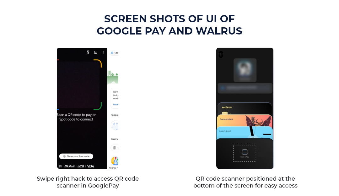
Identifying such pain points can be carried out using UX research strategies. These small yet crucial details can be achieved only with the help of a proper UX Design team. This establishes the brand’s loyalty among customers and makes them feel heard. This in turn helps the brand stay in trend and also invites new users.
Important Things for Creating a UX Design for Fintech Apps
- All the users of fintech apps may not be financial experts, so the design must be clear about crucial details like the amount intended for a transaction, payee details, mode of payment etc. in a simple manner.
- Each step must be made clear to the user. Cross-verification prompts while keying in important information must be implemented.
- The user must be notified of updates via other channels apart from in-app notifications.
- The language must be simple and to the point. Ensure that you use subtle colours and readable text.
- The interface must be designed in a way that reduces the cognitive load on the user.
- The microcopy must be engaging, personal and conversational. Instead of blatantly stating facts, the interface must provide a medium for the customer to express his/her query in a language of their choice. This can be done using a chatbot, which also facilitates connecting to human customer support when needed.
- The visual design, the CTAs, microcopy etc. must be aligned with the goal of the company and the user’s pain points.
- Positive friction must be leveraged so that the users do not make mistakes while using your application.
Fintso is one of our fintech clients for whom we built a simplified platform on which financial advisors can manage their clients, increase their share of wallet, and also offer multiple products through one platform.

