8 Effective UX Writing Rules
Windows error message: The user always is well aware that something went wrong and the system is trying to reconnect.
What is UX Writing?
Design is all about communication. Whether the product is about sales, retail, fintech, healthcare or any other industry, there should always be proper interaction between the user and the product.
By definition, "UX writing is the practice of designing the words people see when they interact with software". The responsibility of UX writers includes creating the words users read or hear at the time of using the digital product. They are responsible for both microscopy (labels for buttons, menu options, error messages) and macro copy (information messages and invitations, text on confirmation pages).

Why is UX Writing so important?
As we know the pen is mightier than a sword, likewise, copies (words) are more impactful than visuals in an interface. A copy can make or break the user experience! No matter how beautiful the user interface is, it is always a disrupting and not-so-good experience if the copy is confusing, it is misleading, or there are grammatical errors. Thus, everything from the smallest label to a message has an impact on the UX. it’s the job of a UX writer to craft the right copy.
Ex: Do you remember this Clippy assistant from windows? It was a great design effort by Microsoft to introduce assistance for providing a smooth experience for the user. (Although it did not turn out to be a great design which could understand user needs exactly, around 1997, this was brought in as a feature to aid users)
Each copy used is done with the idea of improving the user experience while using Microsoft office.
In the past, UX writing often fell under the purview of product designers and managers. Recently, however, the fierce competition across the software industry has driven many companies to invest in dedicated UX teams. UX content writer roles centre on creating successful user experiences through research, feedback, analysis, testing and best practices.
Rules of Effective UX Writing
Like any other practice, there are UX Writing rules as well. If followed properly, it helps in effective UX Writing.
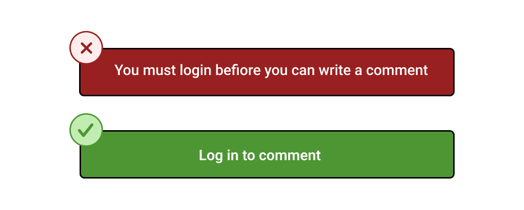
- Use Limited Words: Effective communication always happens when we use limited words. Need to always use simple, generic and impactful terminology that provides the user with ease of performing a task without cognitive load. Always remember that the user always needs to spend time completing the task sooner rather than reading copies on the interface.
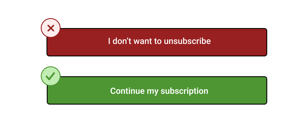
- Avoid Double Negatives: If the copy has a double negative, then the user spends extra time decoding messages. Always the copies must be concise and clear to avoid misunderstanding. Using words that repeat the same meaning will not let the user perform the task with clarity and often the user ends up clueless about the choice he/she makes.
- Prioritize Objectives: The objective of the copy needs to be addressed initially as other content if any. Any sentence should describe the objective followed by the action needed to be taken in order to fulfil the objective. The purpose of the interface is to let the user achieve their goal, So, every copy (Text) used should have a direct meaning of the purpose. Ex: Airbnb always lets users know what is it about and begins the page with the agenda of where you want to go and find properties.
- Easily Translatable: Copies curated must have a universally accepted across linguistic, cultural and geographical boundaries. It is of utmost importance to use easy-to-understand language. This makes the text easily translatable in multiple languages thus making it more user-friendly for users of any region.

Ex: Zomato does a great job in translating The Hindi language into English words to grab users' attention.
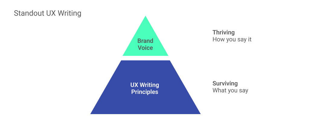
- Tone & Voice: Copies that build trust are essential and provide information that is evident and communicates a clear idea to the user. To achieve that, a UX content writer must consider the brand language and include it in copy throughout the design.

Ex: Apple’s brand voice can be easily identified every time Siri is active on one’s device. Every command that the virtual assistant says is processed and reverted with a clear solution for the users.
- Consistent Copies: To maintain consistency in the copy across the complete application, it is highly recommended to use the same language across the interface. For example, use "Next" every time you direct the user to take the upcoming step, and do not replace it with another word. This gives the user impression that the text is written by the same person. Another common pitfall is combining forms of address. Also, maintain consistency while referring to the users, either addressing them in the first person or in the second person.

- Show, Don’t Tell: Human brains have evolved with recognition through visual memory, although we provide detailed information, humans always look for a visual cue as a reference to accomplish a task. At this point, the use of imagery comes into place as it helps users understand things at a better pace. It supplements the copy and provides additional information. Ex: Swiggy does a great job in telling users by providing info with an icon alone, where the delivery charge is more than normal, due to rains in that area.
- Avoid Showing all the Content at the Beginning: Sometimes it is important to provide all the information upfront, but all too often such details are presented at the beginning. Too much information can quickly overwhelm users and add cognitive load. Thus, reveal detail as needed. Rather you can opt for adding a "Read More" button and link it to the detailed content. This mechanism will help them in getting the summary of what is required and if interested, they can dive deep into the topic.
Conclusion
The design platforms need to consider these principles for an effective digital design. Following these simple and important rules will always help the end user we are designing for, by communicating the right ideas and the right solutions.
The time taken to complete UX Writing is definitely worth it and you will be delighted with the results achieved. But believe me, it’s worth it. Every text/copy you use is part of how you communicate with the user. As a designer, it is your objective to design conversation in a way that communicates the message properly to the user. Altogether, UX content writer creates a distinctive brand or product voice that all other content creators within a company can understand and replicate. Most importantly, they provide digital value to an interface that engages the user for rite time and accomplishes his/her goals.


