Connected Cars: A User Experience (UX) perspective
The century-old automotive industry has been home to digital intervention for the past decade and so. With smartphones on the rise and changing human behaviour, it has influenced the automotive sector as well. This has led to the designing connected experiences in the automotive industry. Advances in connectivity and IoT technologies are opening up a new world of interaction between people and vehicles. Modern connected car technology is enabling people to control many car functions remotely via smartphone apps, creating entirely new digital-to-physical workflows.
While these technological advances have been increasing functionality and ease, they also add to the cognitive load of the driver and are not designed well. Considering the rise of third-party apps in the digital dashboard, we would like to discuss a few design considerations for connected car experiences.

- Seamless Transition Between the Digital and Physical Interaction
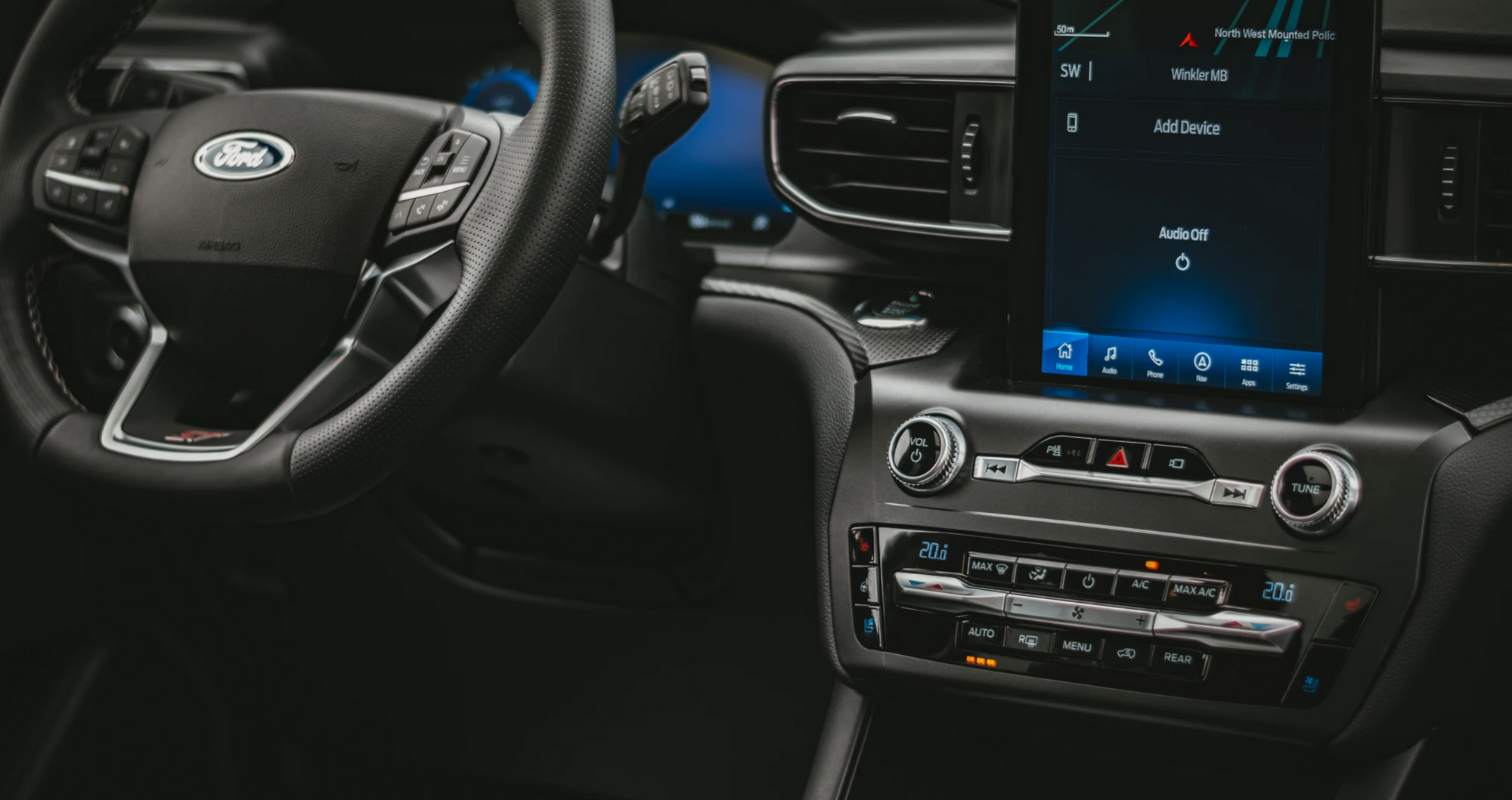
The major automobile functions are tangible and work in a 3-Dimensional space, thus shifting from these to the 2-Dimensional screen should be seamless. The app involves primary functions control of the vehicle and it is dangerous if these functions are activated unintentionally. Thus, the design of elements/toggles should be done in a way that prevents accidental touch. Also, the Call to Action buttons should be able to easily differentiable. The design of the element should be intuitive and should be reflective of the physical interface.
Reducing the number of taps involved in any task can simplify user flows, and also help us narrow the scope of what in-car apps can do.
- Use More of Visceral Interaction
The visceral level of interaction refers to the first impression of a design, both in terms of how the user perceives the product and how it makes the user feel. The interactions should be more natural and instinctive rather than demanding intellect. For instance, using alert tones or screen flashes instead of an alert message display.
These interactions would define the users’ in-car behaviour and will hence improve the driving quality.

- Adapt UI with Context
Smarter cars are not only intelligent but can also be more predictive. Too often, the dashboard human-machine interface (HMI) within vehicles feels disconnected from the broader consciousness of the car and its growing intelligence.
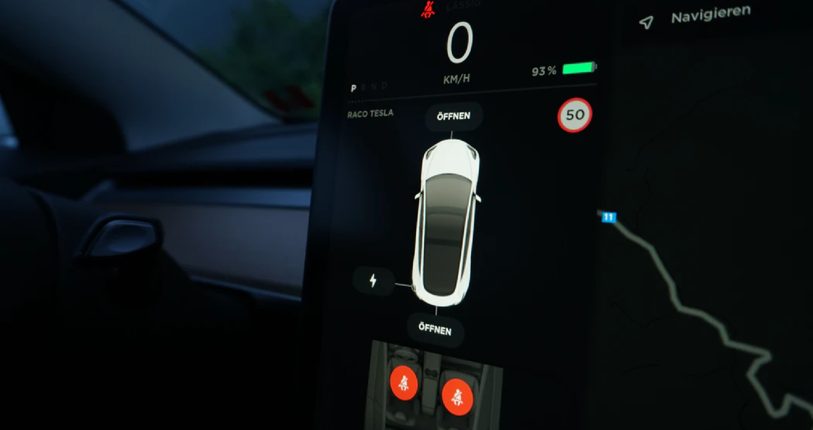
The road conditions can make it hard for the user to tap the desired button. So, the button to be at least 180 x 250 pixels on a 300 dpi screen. Consider designing for ambient light/ time of the day

- The User is in Control of the System
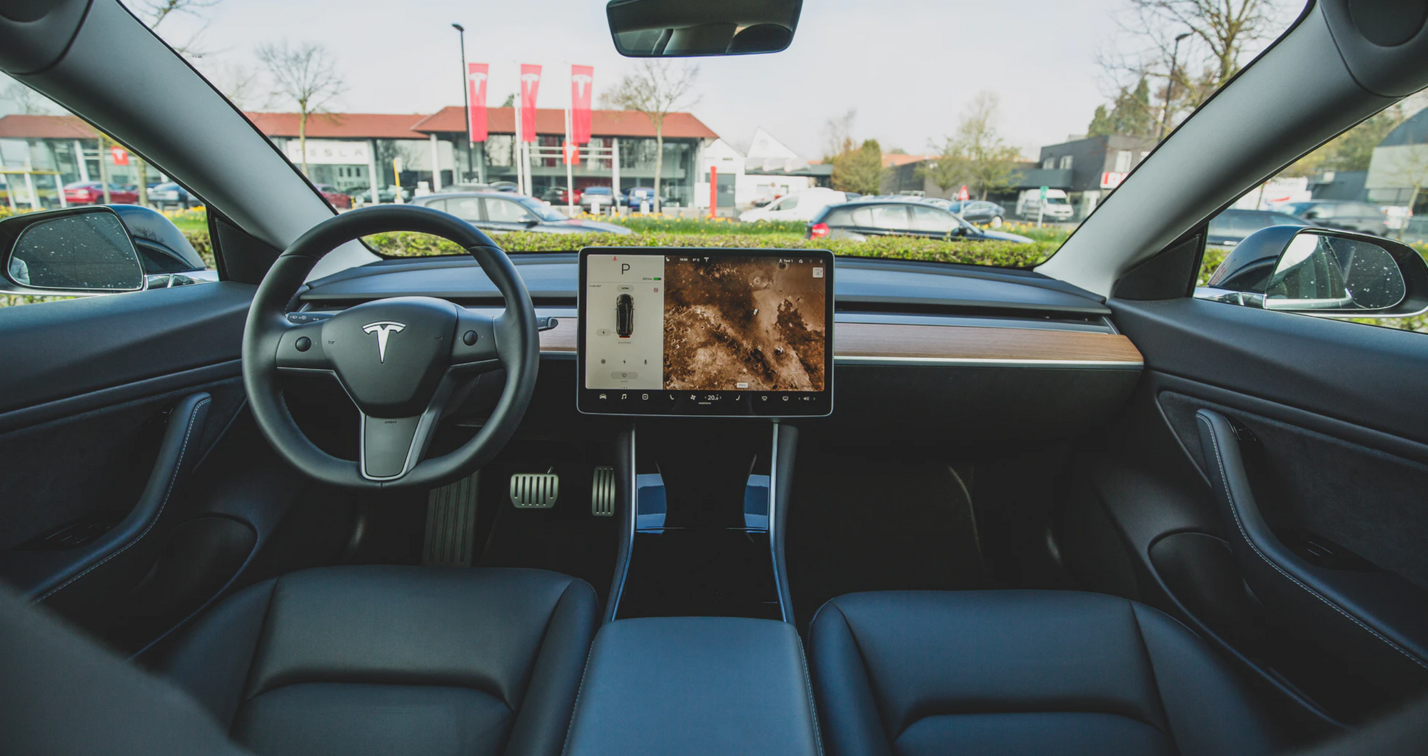
Focus on clarity, and minimizing the amount of visual clutter or decoration in the UI, are best practices where attention is limited and even the occasional glance is a luxury. Automotive displays have to factor conciseness and clarity into account in completely new ways. Identifying which tasks are most relevant to drivers is the most important task. With a plethora of available car interface controls, drivers can easily become distracted or overwhelmed as they interact with the vehicle.
A car in motion doesn’t lend itself to precise touch targets, so car interfaces need to provide drivers with multiple ways to interact with their vehicle through a combination of quick, broad actions and focused precise modes.


