How to create Flutter Responsive UI app from scratch
What is a Responsive UI?
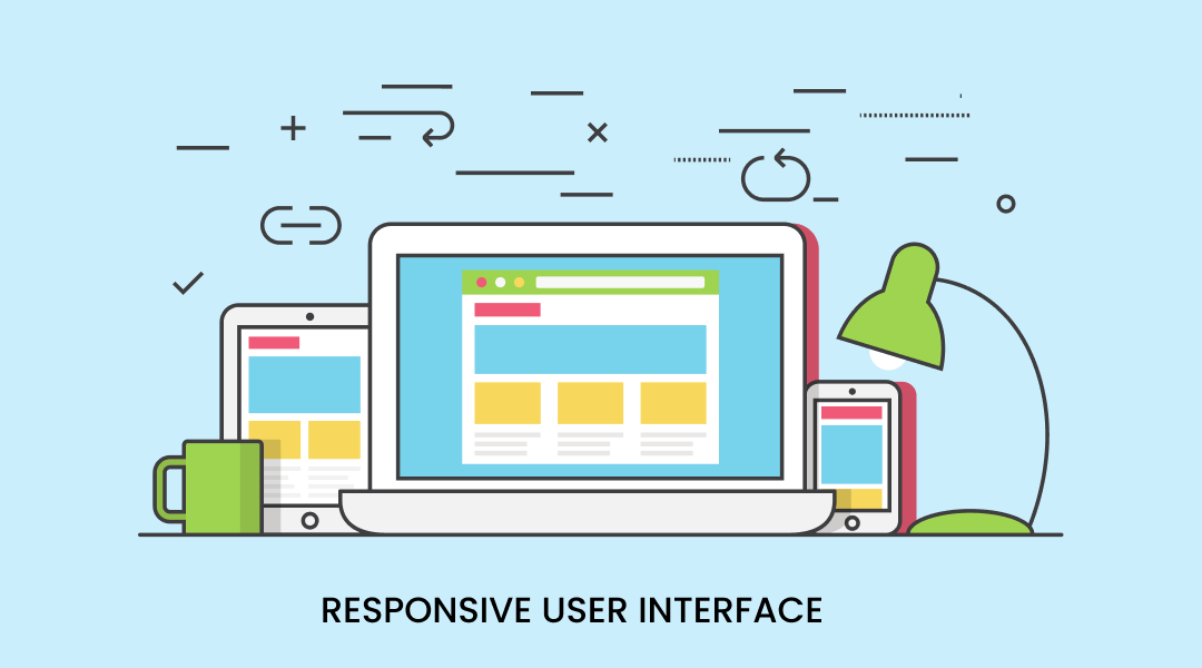
Responsive UI (user interface) is a design approach that allows mobile and web apps to adapt their layout and design to the size and shape of the device or screen on which they are being displayed. The goal of responsive UI is to create an optimal viewing experience for the user, regardless of the device or screen size.
In a mobile app, responsive UI allows the app to adjust its layout, font size, and other elements to fit the smaller screen of a smartphone or tablet. For example, the app might display a single column of content on a small screen, but switch to a multi-column layout on a larger screen. This can help ensure that the app is easy to use and provides a good experience on a variety of devices.
Similarly, in web development, responsive UI allows the web pages to adapt their layout, font size, and other elements to fit the size of the device or browser window on which they are being displayed. It helps to ensure that the web pages are easy to read and use on a variety of devices, from desktops and laptops to smartphones and tablets, thus making it a flutter responsive design.
Responsive Design Goals
- Larger audience: The more devices an app can be run on, the wider audience it will attract.
- Lead users to the purchase: For sure, there must be an emotional component pushing people to move intuitively on the user path. Simply speaking, it’s thinking ahead about all user stories.
- Brand awareness: A beautiful design makes your brand easy to recognize among competitors.
- Improved SEO: Responsive web design enhances search engine optimization through stronger backlinks and better bounce rates.
- Improved online and offline browsing experience: The first impression is everything, free your users from zooming and pinching their screens.
There has been a significant audience transition in favour of mobile browsing. Responsive design is the easiest way to reach users across multiple devices and ensures a smooth user experience.
The Problem
The question that we’re answering today is “How can we provide all relevant information at a widget level to modify our UI ?”.
The Solution
The are two ways to solve responsive UI
- Using Flutter Class
- Using Packages
Firstly, we will see using the Flutter core class which the flutter framework is providing.
- LayoutBuilder
- MediaQuery
- AspectRatio
- FittedBox
- FractionallySizedBox
- OrientationBuilder
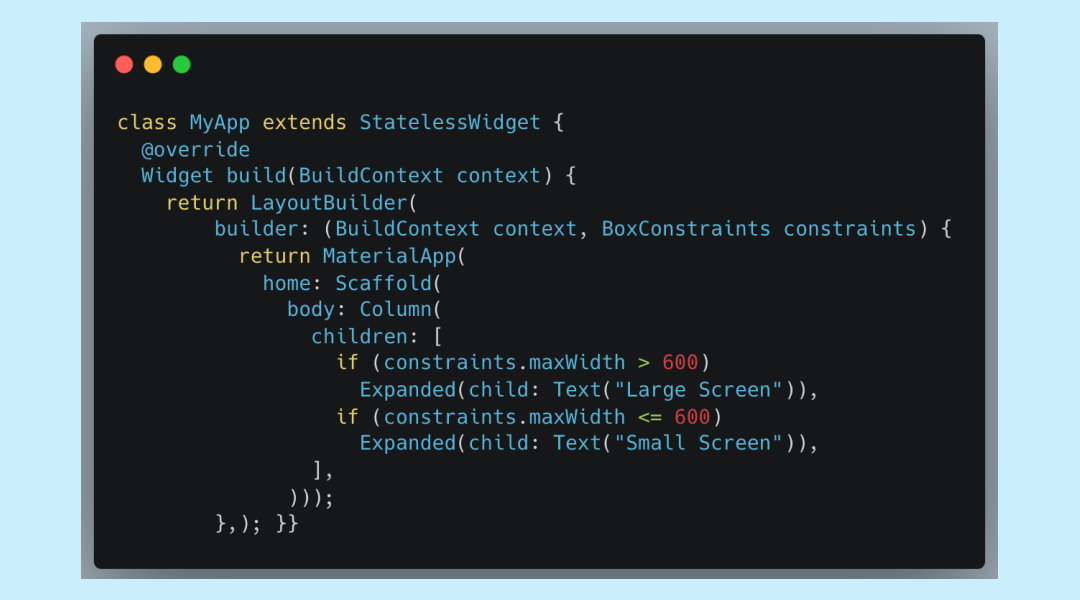
a. LayoutBuilder
Layout Builder changes the UI according to the size constraints of the device screen. Layout builder takes a builder which returns a widget and changes the view according to the condition specified by the user.
In the parameters, the builder takes a Buildcontext and BoxConstraints.
- BoxConstraints
1. Creates box constraints with the given constraints.
2. Click here to read more about the BoxConstraints class.
3. We can also get the maxWidth, minWidth, maxHeight, and minHeight.
b. MediaQuery
Use the MediaQuery.of() method in your build functions.
What is the MediaQuery class and which properties are provided in the build method? The MediaQuery class is used to determine the size and characteristics of the screen on which the app is being displayed. The MediaQuery class provides several properties that you can use to determine the screen size, resolution, and other characteristics. These properties include:
- size: The size of the screen in logical pixels.
- devicePixelRatio: The ratio of physical pixels to logical pixels.
- textScaleFactor: The scaling factor for text.
- platformBrightness: The current platform brightness (e.g., light or dark).
- padding: The padding around the screen.
- viewInsets: The space that the system software occupies around the screen.
You can access the MediaQuery data through the MediaQuery.of(context) method which will give you the current MediaQueryData object. You can also use the MediaQueryData fromWindow method to create a new MediaQueryData object from the window.
Here's an example of how you might use the MediaQuery class to create a responsive UI in a Flutter app:

Using Package Or library
- flutter_screenutil
https://pub.dev/packages/flutter_screenutil
- responsive_framework: ^0.2.0
https://pub.dev/packages/responsive_framework
- sizer: ^2.0.15
https://pub.dev/packages/sizer
- responsive_builder: ^0.4.3
https://pub.dev/packages/responsive_builder
- adaptive_breakpoints: ^0.1.4
https://pub.dev/packages/adaptive_breakpoints
Flutter Support for Foldable Devices
Flutter, being a flexible and expressive framework, allows developers to create apps that can run on foldable devices, like Samsung Galaxy Fold, Huawei Mate X and Microsoft Surface Duo.
Your app is already aware of one type of display feature if you use the SafeArea widget to avoid display cutouts. The three types of display features that we add support for are the cutout, hinge, and fold.
Display features are properties of the display. This kind of information is provided by MediaQuery. We are adding
- displayFeatures – a list of all display features.
- hinge – a simple way of knowing info about the hinge.

Here are some tips for creating responsive UIs in Flutter:
In order to create responsive UI, its important to have flutter responsive design and with the following tips, this process becomes fast and seamless.
- Use the LayoutBuilder widget: The LayoutBuilder widget allows you to determine the size of the screen, and then adjust the layout of your app accordingly. You can use the LayoutBuilder to determine the maximum width or height of the screen and then adjust the layout accordingly.
- Use the MediaQuery class: The MediaQuery class allows you to determine the size and characteristics of the screen on which the app is being displayed. You can use the MediaQuery.of(context).size property to get the size of the screen and then adjust the layout of your app accordingly.
- Use the WidgetsBindingObserver class: The WidgetsBindingObserver class allows you to detect changes in the screen size and orientation, and adjust the layout accordingly when the device is folded or unfolded.
- Use the Expanded widget: The Expanded widget allows you to specify exact sizes and positions for widgets, which can be useful for creating complex, responsive layouts.
- Use Flexible widget: Flexible widget allows you to define the proportion of space that a child widget should take up with other children in a Flex widget. It allows you to create a dynamic and flexible layout.
- Use Responsive Widget: Many libraries provide responsive widgets, like flutter_responsive and responsive_builder. They provide an easy way to create responsive widgets that can adapt to different screen sizes and orientations.
- Use OrientationBuilder: OrientationBuilder allows you to determine the current orientation of the device, and adjust the layout of your app accordingly.
- Use responsive font sizes: Use the MediaQuery class to determine the screen size and resolution, and then adjust the font size accordingly.
- Test your app on different devices and screen sizes: Test your app on a variety of devices and screen sizes to ensure that it looks and behaves correctly on different devices.
By following these tips, you can create a responsive UI in Flutter that adapts to the size and characteristics of the screen, providing an optimal viewing experience for the user.
Conclusion
Whether you use Flutter class or any package or libraries, the end goal will be achieved. But with the tips that have been shared at the end of this blog, the whole process of creating a Flutter responsive UI app becomes easier, and faster.