Benefits of Dark Mode along with some quick tips
What is a Dark Theme?
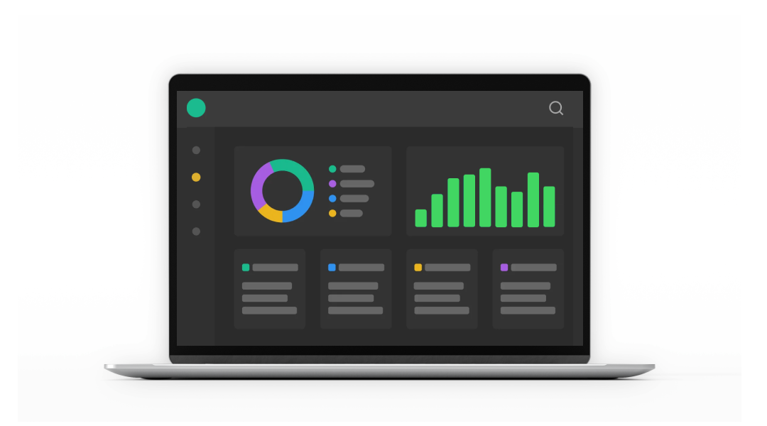
A dark theme is a user interface with a modified colour, commonly referred to as night mode. It has a black background with a light foreground, light lettering, and light elements. The UI elements used in dark mode are usually backgrounds with black and grey colours as shown in this picture.
Now before diving deep into the dark theme, let's understand why we need a dark theme or a dark mode.
"To improve is to change; to be perfect is to change often." -Winston Churchill
Very rightly said, the above quote points towards change. For almost three decades we have been used to seeing dark-coloured fonts on a white-coloured background, but do you recall the time when those giant-sized computers had green-coloured UI with white text on them? Already seems like a century ago, right? But with the arrival of applications with iOS 13, things changed all of a sudden. People once again started liking it so to say "for a change".
This change with dark theme design was accepted with a few combinations of light and dark and the UIs as a result were amazing. While some people liked the pop-up of text in white colour, others were happy with the ease of finding relevant options easily.
The use of dark mode then became a trend and continues to be the favoured choice for many organizations, UI/UX design studios, UI/UX designers, and the users themselves. Now, even though the dark theme is very popular and makes astonishingly stunning user interfaces for several software applications, it is of utmost importance that designers should opt for the right colour choice. Just like clothes, colour contrast plays a supremely important role in the design of any UI. Discussed in the next sections are some utterly useful tips that can help you design an appealing UI for your app.
Important Tips while Working on Dark Theme
- Refrain from Using Pure Black: If you are a beginner, you might be craving to use pure black colour as a UI theme. Also, it looks pretty tempting and cool but the truth is that very high contrast colours might result in pain to the eyes, especially while switching between the content and the background. Hence it is recommended to use dark grey in place of black and light grey in place of white.
- Think Twice Before Using Saturated Colours: The use of saturated colours on dark themes may look exponentially vibrant thus giving a punch effect to the eyes. These colours might pop up as the first choice in a designer's mind to balance the colour scheme, yet choosing saturated colours wisely is another important thing to consider while using font colours, buttons, etc. in a UI. Hence, it is advisable to perform corresponding colour tests before using colours like neon blue, neon green etc.
- Take Care of your Brand's Identity: Using a dark theme is not an easy of a choice, especially for brands that are trying to establish their business identity. Therefore, it is important to find the right balance between your brand and the colours used. Even though the theme used is dark, the colours should never suppress the emotions that you want to deliver as a brand.
- Less or No Use of Shadows: Shadow is itself a dark-coloured reflection of an object. Using shadows in a dark theme is not at all a good idea. Even if it will take a lot of effort in creating a shadow, it will either be more intense than the background or will be lighter than the object. In both cases, it is of little or no help at all.
- Give Users the Choice to Switch Modes: Dark modes, though appear to be cool and trendy, might not be the top choice for many users. Therefore, you must always give users the option to switch between themes. This will give users a sense of control as well as help them easily go back to the regular theme.
- Clever Contrast and Lighting: Since we can't use shadows in dark mode, what is that you can do to make your design more appealing to users? Introduce contrast and lighting smartly. Declutter wherever it is required and make your design stand out with the use of negative spaces in your favour.
- Test your Design with End Users: Testing your design with end users is the final and most important step as it gives you the best picture of the design. It helps you attain the confidence that your design is solving customers' issues and helping them in several other ways. Remember, a good user experience is the result of a good UI.
Benefits of Dark Mode
There are several benefits of using dark theme design in UI, few of them are discussed here:
- Comfortable for Eyes: Dark mode doesn't attack your eyes with the flash that light mode does. Whether you are using your device in light or dark, the dark theme is always comfortable for the eyes and doesn't black out your vision with the sudden flash of the light theme.
- Enhances Battery Life: Mobile phones are not just phones these days but are so much more. From making payments, online shopping, and keeping notes, to making calls, you can do everything on phone. And in such cases, good battery life plays a vital role. Dark theme is therefore not just a change but a damn useful one, as it saves your phone's battery thus enhancing its overall life.

- Has Good Appeal: The dark theme looks so cool and awesome. It gives UI a very unique look that is unusual as well as mysterious at the same time. With its characteristics going well with younger people, it is they who adapt to dark themes more quickly and in great numbers.
- Increases Users' Focus: With its dramatic canvas, the dark theme helps users to stay focused as they usually focus only on the useful and relevant information on the screen. If designed while paying proper attention to the key elements, dark theme UI is undoubtedly the best option to keep users glued to your app.